Exposure (with its three components: aperture, shutter speed and
ISO sensitivity) is extremely important to make a successful photograph but it is not the only technical aspect that influences the final rendering of an image: the composition is just as important!
Read A Simple Way to Understand Aperture, Shutter Speed, and ISO
But what is composition?
Composition is actually the way you will arrange the different elements of the scene that you are photographing. You can do that by positioning yourself from a specific angle or by moving objects. It is therefore necessarily dependent on the format of the frame, that is to say, the shape of the rectangle that you see in the viewfinder.
Small digression on the format:
With an SLR, your photos will be in the traditional format: 3/2. With digital compacts or many hybrids, the format is 4/3. But you also have many more different format cameras. The use of software also allows you to change your formats, like cropping your image to a square for example.
The composition is the way you will frame your image.
It depends on:
- The presence or absence of certain elements
- The place given to each element (is it small or big in the image?)
- The sharpness of all or part of the image (and thus the depth of field)
- Perspective
- The leading lines of the image that will guide the eye
- Colors, or contrasts between colors, or between dark and light areas (therefore exposure)
As you can see, framing a photograph involves working on many factors, some of which are related to the exposure of the shot. It would be too much to tackle all these points in one article, so let’s focus on composition.
Composition rules:
Composition is influenced by certain timeless “rules” that already existed before the first cameras were invented. Indeed, most of the classic rules of composition are directly derived from paintings.
They come from our culture, our history, and allow us to better understand the photographs since despite what we think we are not neutral in front of an image. Whether it is conscious or unconscious, we are influenced by everything we have seen before. Thus we read the images as we read a text, that is, from left to right and from top to bottom. People whose mother tongue is read from right to left have a tendency to read the images differently.
Are the rules really valid?
In reality, there are really no rules. Instead, think of them as a guiding principle, outlines that will work pretty well, and easily.
Keep in mind that many excellent photographs frankly violate the rules.
But if it is important to know them, it’s because the rule of thirds has a big advantage: it is very simple (simplistic in fact), and suddenly you can easily remember something that will force you to pay attention to the composition. It’s the main advantage: to give you the reflex to think about your framing composition!
If you choose not to respect them, as for each choice of composition, do it frankly!
Its an extremely simple and well-known framing rule.
It consists of placing the important elements of the image on the vertical and/or horizontal lines that cut the image into thirds, or even their intersections (which are the strong points of the image).
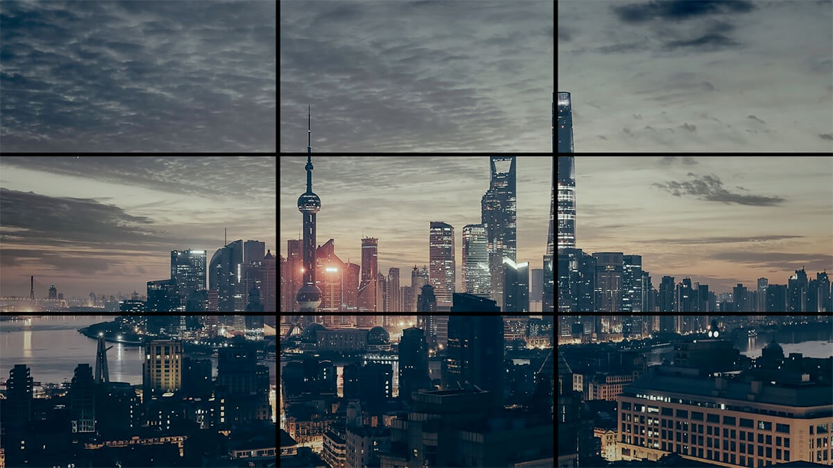
We use this ratio to draw imaginary lines on a rectangle image. The lines cut the image into 3 vertical and 3 horizontal identical parts. It sounds complicated like that, but in fact, just cut the image into 9 parts like this:
The grid divides the image into 3 equal parts vertically and 3 equal parts horizontally, ie 9 equal parts
This rule has several consequences :
The most important horizontal lines must be placed more or less along with one of the two horizontal axes. Like the horizon for example, as you can see in this photograph:
- Or the most important vertical lines must be placed along one of the two vertical axes. Like in the example below:
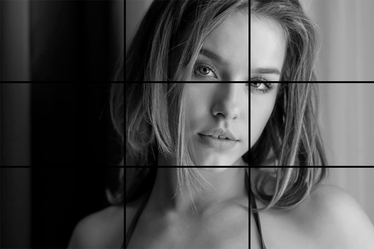
You must place your subject on one of these lines, or one of their intersections (strong points). If the subject is in the middle of the image it seems too static. It is always better to try to place your subject on one of these imaginary lines or intersections.
Move your subject away from the center to achieve a visual balance. In the image bellow you can see that the focal point of her eye is on a strong point.
So do not center your subject or even the elements around it.
This rule is particularly telling in landscape photography, even in portrait, but it is useful in any type of photography!
When to break free from the rule of thirds?
This rule is designed to avoid cutting the image in half. When you break it, it is precisely for the purpose of cutting it in half, which you can do for two main reasons:
1- Highlight a symmetry, such as this pier bellow:
2- Or highlight the difference between two atmospheres when it is possible
Try to apply this rule because it will greatly improve your photographs!
Want to learn more about photo tips and get inspiration from photographers?


