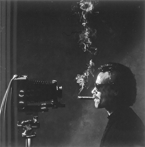
We don't load cameras much anymore but we still aim them and shoot pictures. With that in mind, I have fun describing my pursuit of portraits as a predatory sport: hunting big game. I don't stalk my prey but get close enough for a good clean shot - close enough for rapport as much as proximity - to avoid inflicting gratuitous wounds. I bag my quarry with a lens instead of looking down the barrel of a gun but I still hang their heads on a wall to admire like trophies.
It's exhilarating (dare I pun, a heady experience?) and a privilege to rub shoulders with movers and shakers, people I admire and people I may come to admire, sometimes exchanging ideas and opinions, if only for an instant of egalitarian conceit. A press pass (or sometimes just chutzpah) was my hunting license. It gave me both the authority and the opportunity to memorialize each one of my serial encounters with a physical totem, a portrait. I collect portraits.
By any taxonomy (souvenir, memento, prize, keepsake, trophy, totem, or photographic print), seeking portraits is a rationale for building a collection. I think all photographers are inveterate collectors. My portraits can be found in private collections and museums, including the National Portrait Gallery in London; the Los Angeles County Museum of Art; and the San Francisco Museum of Performance and Design. All of my black-and-white negatives and color transparencies are archived at the Briscoe Center for American History at the University of Texas at Austin. By chance, my first two portrait subjects were
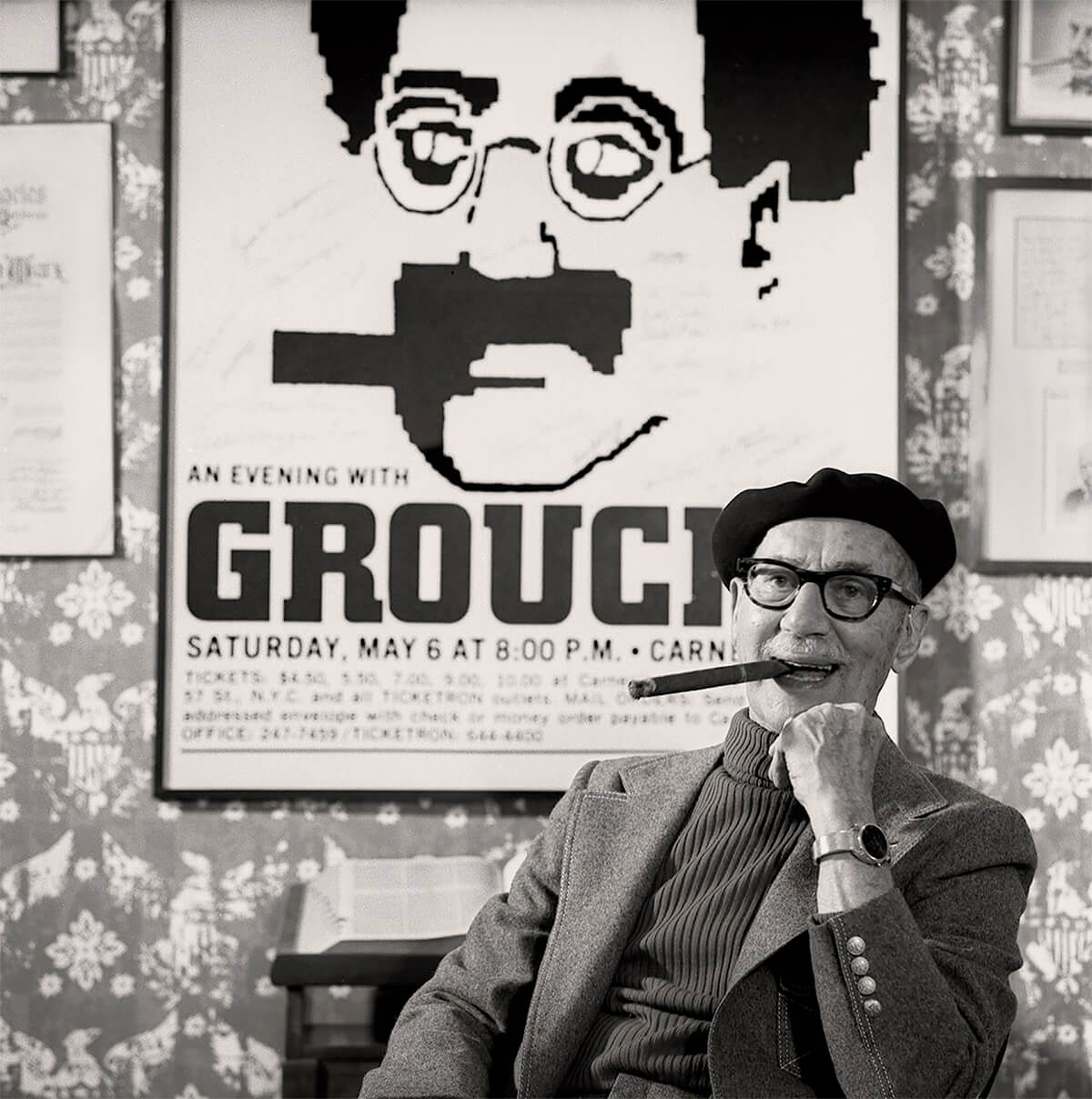
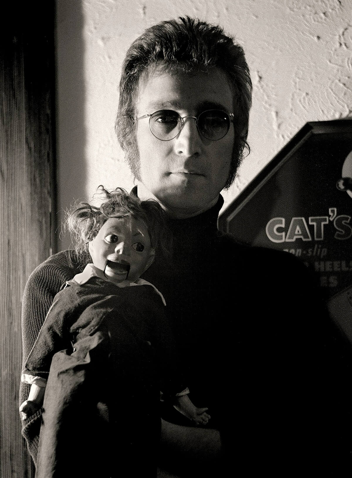
Marx and Lennon - Groucho and John.

Groucho Marx 1971 © Tom Zimberoff

John Lennon 1973 © Tom Zimberoff
Everyone has a camera. We all take pictures; we've all had our pictures taken. We've all got our selfie faces now too. But the experience of being portrayed is an act of total engagement. It often takes place in front of, and is executed by, a stranger. That is not a common experience. It's not at all like posing for pictures with family or friends to post on Facebook. Few of us have been invited to sit for an extended time in isolation with a punctilious portrait photographer surrounded by C-stands, cables, booms, umbrellas, barn doors, flags, scrims and flats - how about a cucoloris? - hot lights and electronic strobe capacitors, not to mention the additional paraphernalia that connects cameras and lenses of all shapes and sizes to computers. Sometimes the experience of being portrayed is as simple having the subject face only a camera on a tripod. But it's unnerving for anyone, under any circumstances, to be stared at through a lens. It's uncomfortable taking direction, being manipulated into a pose. Nevertheless, a first-rate portrait is always - in the best sense of the word - contrived. At worst it's a snapshot.
A photograph captured surreptitiously, or with only the subject's tacit acknowledgment, cannot be rationalized as a candid portrait just for being fleet or unrehearsed because candid portrait is an oxymoron. It lacks both the intellectual rigor and technical proficiency that go into the creation of a telling portrait. The headshot of a wizened old man in some far-flung locale or a pretty girl in native costume come to mind. But despite being sharply focused, well exposed, and adequately composed, these are gross examples of uninspired and derivative souvenirs with no stories to tell other than the captions of peripatetic camera enthusiasts and tourists. On the other hand, whether shot with an iPhone X or a Hasselblad X1D, a portrait is the result of a photographer's foreknowledge of - and collaboration with - a sitter. It is rarely a one-sided depiction because it reflects - more than figuratively - the sitter's participation. It should be self-evident, just looking at it, why a portrait was made; certainly not to recreate a cliché.
Portraitists, whether they rely on film, pixels, pencils, or paint, are storytellers. Photographers who practice within this genre are very concise storytellers indeed, working in a medium with only two dimensions (unlike sculptors) and only one frame (unlike moviemakers). Photographers have less leeway than writers, in particular biographers, who can exploit their readers' boundless imaginations. Yet every portrait is, or should be, both biographical (about the subject) and autobiographical (about the photographer's influence on the subject). One always hopes to make a portrait during an important episode in the subject's life. Why? Because it makes a good story.
Any praiseworthy portfolio of portraiture illustrates as much about the photographer who created it (a body of work) as the scores of individuals it portrays. Its credibility relies on both the practice and presentation of a unique style, a dualism that comes with both the desire and the experience of epitomizing a sitter's physical appearance while conjointly creating a visual allusion to personality. And all this passes through the lens of subjectivity, if you will: the mind's eye of a photographer. The result should invariably give a personal slant but without deliberate misrepresentation.

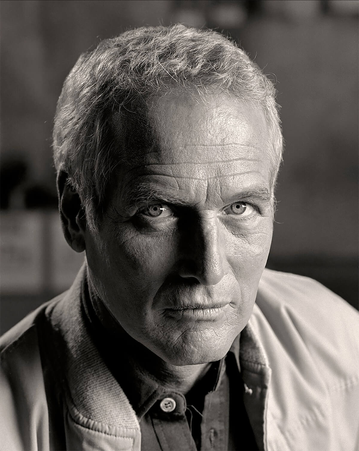
Paul Newman © Tom Zimberoff
Sometimes one popular example is consecrated as the definitive portrayal of someone or other, as if the photographer knew how to distill and bottle some mythical essence of character. I don't buy it. That notion only applies to pictures that agree with what we think we already know about someone; celebrities for example. It's not possible to reveal anyone's life story in one shot, so to speak. Character is too complex, hardly one-dimensional or immutable. And no photographer has the preternatural power to evince an entire range of personality in the wink of a lens. A portrait can, however, achieve iconic status as a best portrayal, powerful enough in its expression of identity to stick and be forever associated with someone, yet illustrate only one aspect of that person's character at one moment in a lifetime.
Yousuf Karsh's portrait of Winston Churchill comes to mind. And though one portrait can jumpstart a photographer's career, I can't think of one portrait that has defined a photographer's career. It takes a lifelong body of work to do that. The Churchill portrait jumpstarted Karsh's career; and his subsequent work influenced a generation of portraitists.
Mirror Mirror on the Wall
Collaboration or not, because photographers are ultimately in control, sitters can feel vulnerable. Photographers have a responsibility to cultivate trust without squandering that currency by letting loose any embarrassing poses, deliberately or inadvertently: the aforementioned gratuitous wounds. But the longer I can cajole sitters to linger in front of my lens, the less determined they are to maintain a self-conscious façade.
It's fanciful to imagine a lens as a sculptor's chisel, chipping away at the surface to reveal what lies hidden underneath. That can be a problem when photographing actors, though, if they insist on staying in character. Wouldn't such a photograph merely be an illustration of the role being played - a performance, artificial and less convincing as a portrait of the actor? Regardless, I try to persuade sitters that their time with me and my camera will be well spent and that their trust and cooperation are essential components of a portrait. It is our portrait. The result, I hope, will transcend the encounter itself. Sometimes it does; sometimes it doesn't. Sometimes, even when I'm pleased with the outcome, sitters may carp about how they look. That's not me, they'll say, or, I never look good in pictures. They may agree it's a fine photograph, just a cockeyed likeness. Well, there happens to be a technical explanation for that phenomenon.
Your each and every day begins, and often ends, with staring at a bathroom mirror. But what you see is an optical illusion. You've gotten used to it. The illusion is created by light bouncing off your face and onto the glass surface of the mirror, then back again. The light travels measurably twice the distance from your eyes to the mirror, revealing an effect called optical foreshortening. It changes the apparent distance (your perception) between objects in the foreground and the background, relative to where you stand. Looking at yourself in a mirror is like looking at yourself through a telephoto lens.
Some people call a telephoto lens a portrait lens because it flatters by, well, flattening. It compresses perspective, making the tip of your nose look closer to your ears. The effect is very subtle but it's plain to see in two dimensions (pun intended). Alternatively, if you are photographed up close with a wide-angle lens, you'll have a big schnoz and itsey-bitsey ears, the way you'd look to someone who got in your face, standing nose to nose, or vice versa. You hardly look bad in photos but you may expect to see something different, more familiar: your reflection in a mirror. There's more.
Your reflection is backward. Flipped. Reversed. That, too, plays tricks; this time with facial symmetry. The camera sees you the way everybody else does: un-flipped. The mirror's makeover is also complemented by the typical quality of bathroom lighting. It bounces off walls, ceilings, and countertops, or comes through a skylight. It's shadowless. It diminishes facial lines and wrinkles. Sometimes bathroom mirrors are surrounded by soft-white lightbulbs (imagine a dressing-room vanity) designed for makeup application It, too, flatters by taking shadows away. Sorry, but the way you look in photos is the way you really look. But don't worry. You'll discover the magic in how you become more attractive as your photographs age.

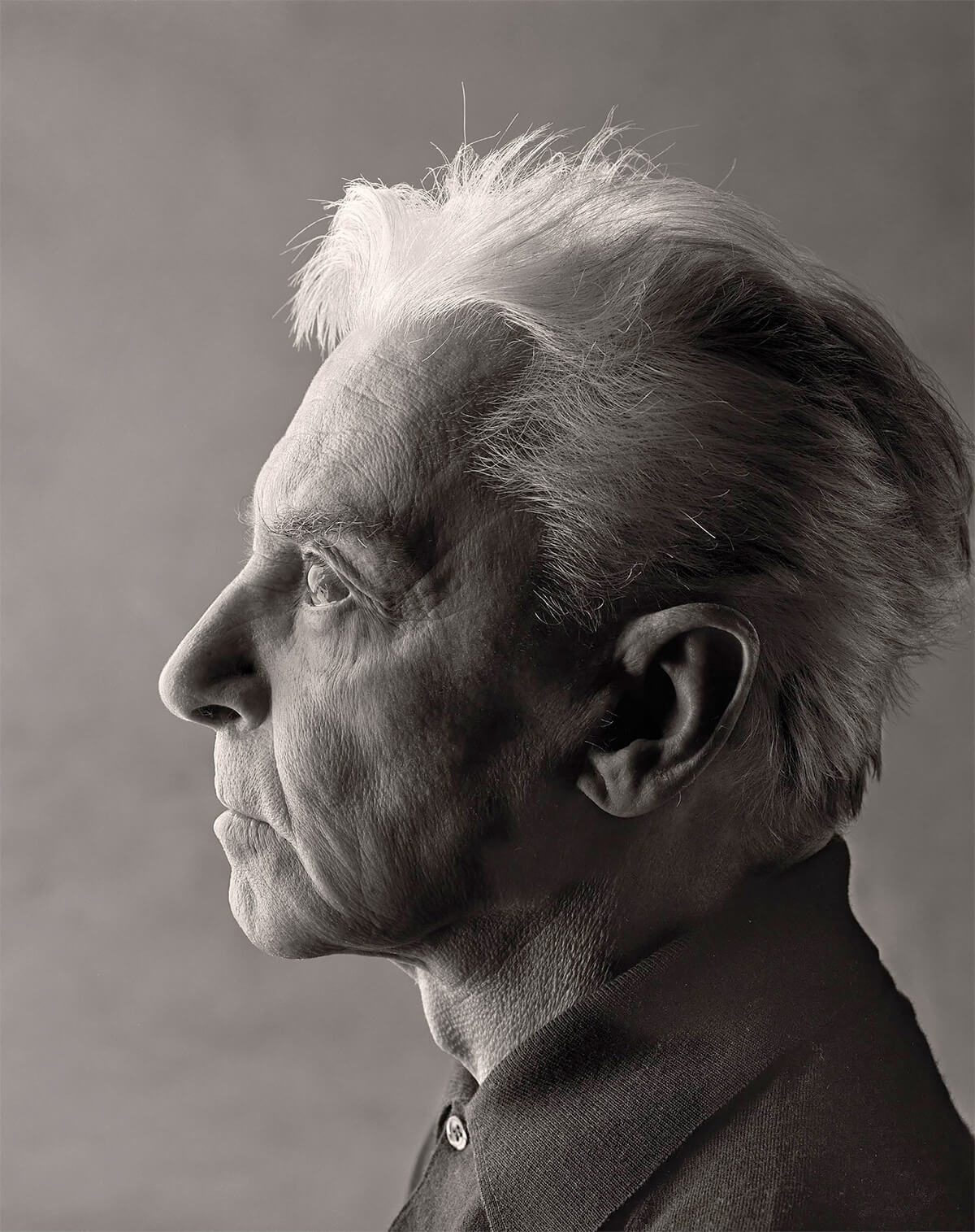
Herbert von Karajan © Tom Zimberoff
A technology-addled public is rather indulgent about what gets labeled as a portrait these days. A marketing mindset seems to be that portrait is a format, not an artform. However, the convention of vertically-framed faces versus horizontally-framed landscapes has little to do with defining the art of portraiture. Portraiture uses both formats to good advantage, plus a third square format. Format notwithstanding, the number of hits one finds by searching online for how to take portraits further confounds me because portraits are made, not taken.
In the hands of an artist, even an iPhone is a fine tool for making portraits. But a proficient photographer can make extraordinary portraits with a pinhole in an empty oatmeal box and a piece of film Scotch-taped inside. It's the result that counts, not the kind of camera used to create it.
Nevertheless, Apple's advertising copywriters have appropriated professional jargon about backlighting, depth-of-field, and the golden hour to convince the hoi polloi that they can be as proficient with portraits - on an iPhone - as any Annie Leibovitz. They also extol the iPhone's multiple-lens feature (in their ads) as the way to take better portraits without calling out this technique for what it is: a workaround.
This workaround is a simulation of the bokeh effect: throwing a background out of focus to make a headshot look more portraity (my word, not theirs). Bokeh, shmokeh! It's just someone else's made-up word for the technical term depth-of-field. The simulated effect is enabled by software and touted by technologists, not artists. It is augmented by any one of five - count 'em, five! - dramatic lighting effects (Apple's claim).
But an iPhone cannot - nor can any smartphone - alter the directional quality of light. Nor can an iPhone change spacial perspective; that's the job of actual telephoto and wide-angle lenses in conjunction with their variable apertures; to make things look closer together or farther away - from each other - not from where the photographer stands. An iPhone cannot control which specific elements in a composition are out of focus, and iPhone users must accept low-resolution image capture, rendering smaller prints. Finally, iPhone users must accept someone else's pre-set idea (an Apple engineer working with a photography consultant) of what photographs should look like: an algorithm.
On the other hand, any creative technique can be dialed in at will by a skilled photographer with a conventional camera. That's the artifice, if not the art. Eyes and lenses are limited by the laws of physics; imaginations are not. The virtual definition of a photographer-as-artist, if you will, are those who can reflect how their imaginations perceive reality and then present their results for others to see in two-dimensions, frozen in time, the way we, the photographers, saw them in the first place. That is the art, not the artifice.
The complexities of f-stops, shutter speeds, and the specific focal-lengths of lenses are understandably automated by companies like Apple, enabling ordinary consumers to achieve consistent and satisfactory results. However, it's important to note that technology doesn't make it easy to create a portrait; it merely makes it easy for anyone to press a button and capture a person's likeness in a manner that resembles a portrait; but one that is no more sophisticated than a reliably attractive headshot. No experience necessary.

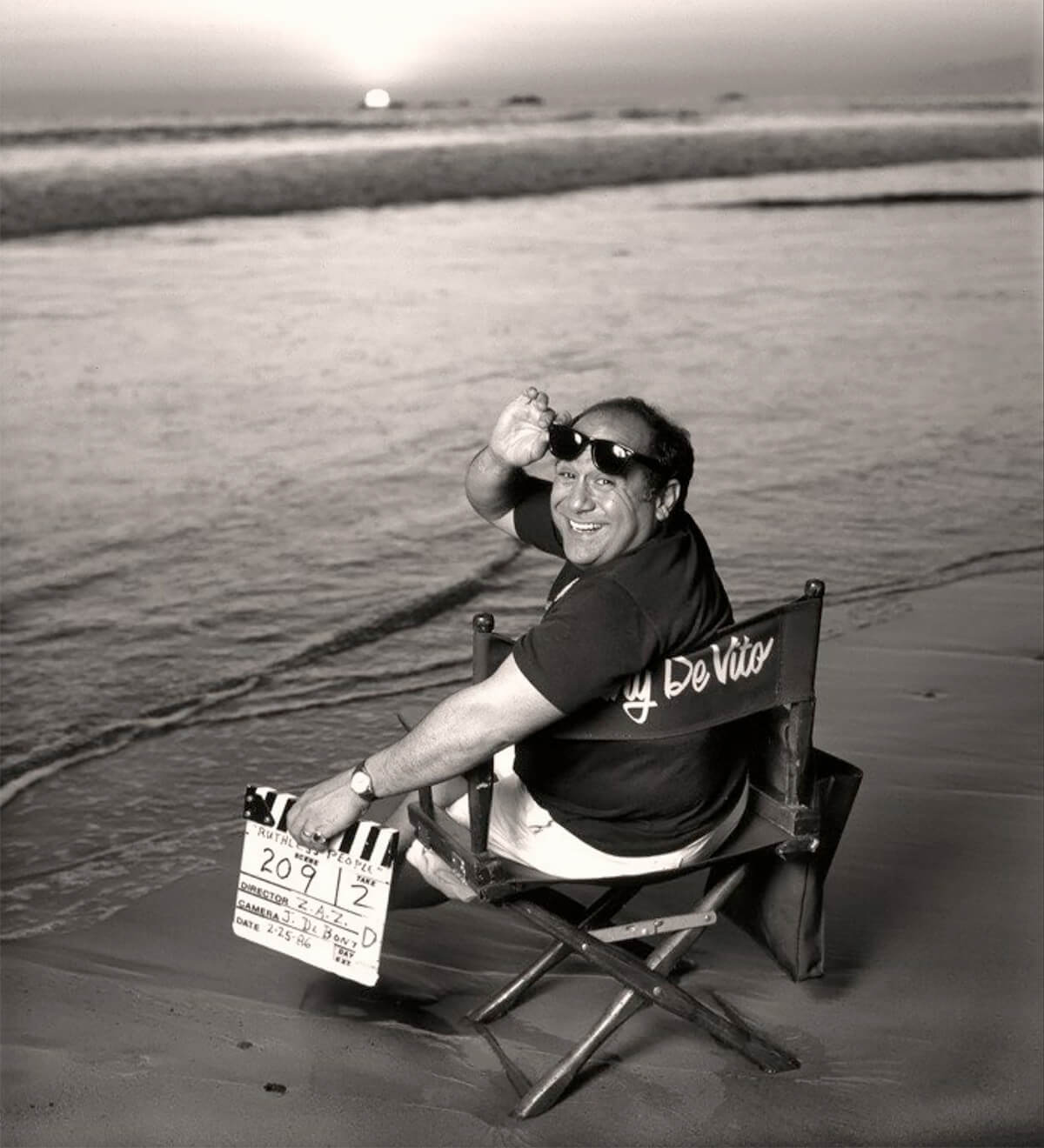
Dani De Vito © Tom Zimberoff
It has only recently become popular to call any single-focal-length lens a prime lens. But that's a cinematography term appropriated by still photographers only since the advent of DSLRs (digital single-lens reflex cameras) because those kinds of cameras also shoot video. A so-called prime lens usually falls somewhere between what we mean by wide-angle and telephoto, measured in millimeters and representing a specific focal length. Many sophisticated still photographers call it a normal or standard lens. Prime meant normal to users of motion picture film.
The measurement of a normal focal length lens, in millimeters, varies in proportion to the physical size of a light sensor (or the film) inside a camera which, in turn, corresponds to the dimensions of each individual sprocketed frame in a roll of 35mm film: 24mm x 36mm. That's what it meant by the term full frame. That measurement, too, is a convention taken from cinematography. Therefore, if a 85mm lens renders a modest telephoto effect, and a 35mm lens renders a modest wide-angle effect, a 50mm was traditionally called a normal lens because, right there in the middle, it approximates the normal field of human vision, what the unaided eye sees with a hint of peripheral vision but without forced perspective. It's a somewhat subjective call.
A telephoto lens comes into play when a photographer wants to compress the perspective effect between objects within a narrower frame of view. That means changing the viewer's relative perception of distance between what's in the foreground and what's in the background, as if the normal field of the viewer's vision had been cropped tighter, or zoomed in. Sports and nature photography notwithstanding, a telephoto lens is not used by judicious photographers simply to get closer to the subject matter. (You can crop a photograph shot with a wide-angle lens, for instance, and the result will be exactly the same as if you had used a longer-focal-length lens, albeit with somewhat less resolution because of the mechanical cropping factor - blowing up something small to appear bigger.) Using a telephoto lens also makes objects in the foreground and background appear to be closer together in size, as well as more proximate to each other. The opposite effect applies when using a wide-angle lens. (A wide-angle lens is not ideally used to get farther away from a subject).
Every time a pro or a dedicated amateur picks up a camera, a decision is made: a tandem choice of focal length and aperture; that is, how long the lens is (e.g., 100mm telephoto vs. 300mm telephoto) in conjunction with its maximum aperture, which is the size of the opening through which light enters the camera. The word camera, incidentally, comes shortened to English from the Latin camera obscura. It means dark room. That's what a modern camera is; a miniature room bereft of light (a dark enclosure). Thus, not only does aperture affect exposure (of film or digital sensors exposed to light), but shooting with a wide-open f-stop (the unit of measurement for aperture, like f2.8, instead of stopping down a variable diaphragm to a smaller opening, like f5.6) will result in shallower depth-of-field; that is, whatever is in front of the focal point (the subject) will be blurry, and whatever is behind the focal point will be blurry, too. Incidentally, when the pupil of the human eye, or the iris in the center of the eye, alternatively opens up or stops down organically, its purpose is less about perspective and almost entirely about letting in more, or less, light. It is merely a perception, a neurological reaction of the brain, that accounts for perspective and exposure.
It is a misconception to believe that the maximum aperture of any given lens is the one you should predominantly use to make portraits. Yes, you paid more money for that fast lens; but save that wide-open orifice for shooting sports or stage performances in dimly-lit auditoriums because it affords the use of - ah ha! - faster shutter speeds to stop action. Do not be disposed to think, I paid more money for this f2.8 lens than I would have for an f4.0 lens of the same focal length, therefore I'll always use f2.8. That's not a good idea. Often, albeit not always, a lens's best-resolving aperture (sharpest imaging) is somewhere in the middle of the aperture scale (the numerical ring around the lens barrel); say, f5.6 on an f2.8 (maximum aperture) lens that stops down to f16. Besides, you can still throw a background out of focus with a relatively smaller aperture and get an interesting result. The ability to make judicious choices of aperture, to achieve various and specific effects, comes with experimentation. Also, as often as not, one's composition of objects within the camera's frame when shooting so-called environmental portraiture must clearly - often sharply - show what's behind your subject, as well as what's in the same plane of focus or even in front of the subject.
And don't get me started on the locus of focus, or any other hocus pocus, involving the mathematically elegant Scheimpflug Principle, which describes how to maximize both depth-of-field and perspective with lenses and film holders that can swing, tilt, and shift!

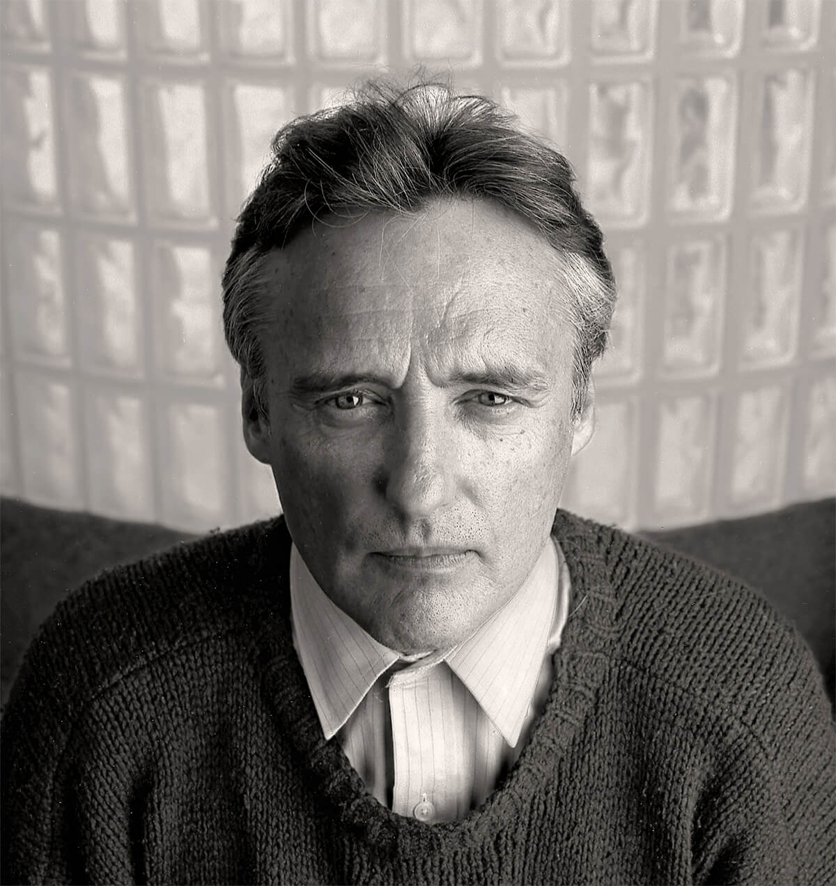
Dennis Hopper © Tom Zimberoff
A photographer usually culls the final version of any given portrait from many similar takes; i.e., different exposures, poses, props, and backgrounds used to get the shot. (As often as not, assistants and stylists were also involved.) If a photoshoot is commissioned for publication, it is the client's prerogative to choose the final result. Otherwise, the choice is the photographer's alone, the subjective choice of an artist.
Creating art makes us human.
Looking at humans as the subjects of art comes full circle with portraiture.
In the past, we might have shown sitters a Polaroid or two during the shoot, if they were adamant about previewing the results; there was no computer screen to apprise when shooting film. Polaroid exposures almost always preceded exposures on conventional film (at least since the late 1960s) to confirm that the camera's shutter (or the lens's shutter) was syncing with the flash, or to preview the effects of each subtle tweak of a lighting set-up; or to confirm that a certain pose worked out, etc. This was especially true on location shoots, away from the studio. We amused ourselves by calling them Paranoids. They gave us some reassurance that the pictures would come out, hours or days before we got our film back from the lab. (For a while, I processed both color and b+w film in my studio.)
How long does it take to make a portrait? The glib answer is 1/125th of a second. But that doesn't account for all the work that must be done before pressing the shutter release. Spontaneity and serendipity have parts to play but wise photographers don't count on good luck when presenting a portrait as the still-life of a human being, with its meticulously composed personal features, posture, apparel, and props. The process of preparing a person for a portrait is not altogether unlike arranging a bowl of fruit to be bathed in light.

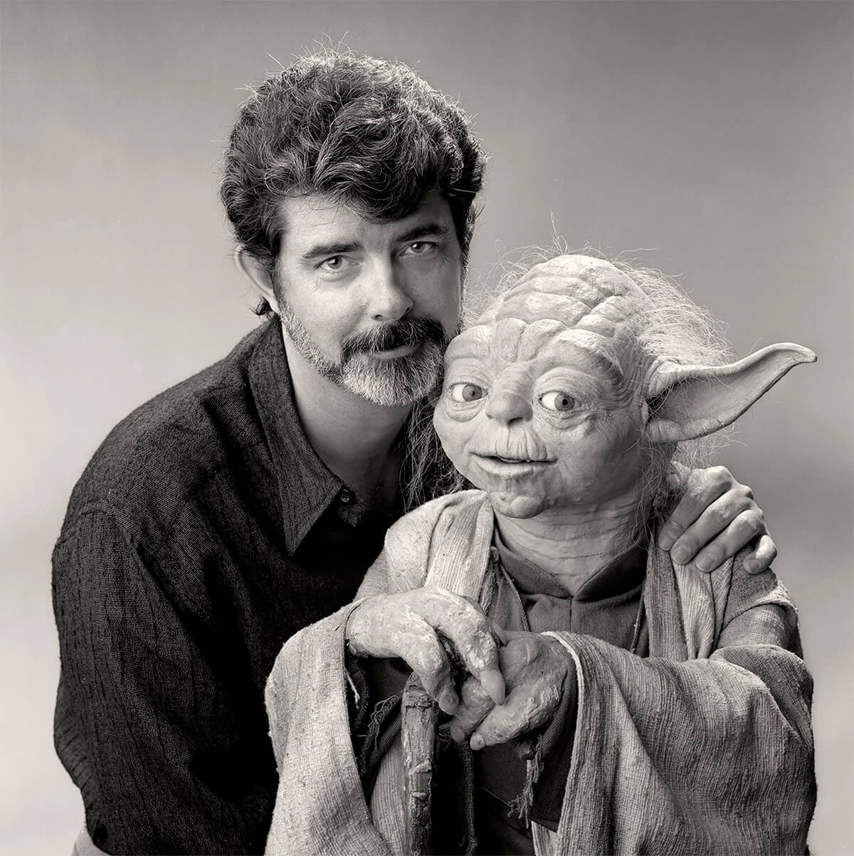
George Lucas and Yoda © Tom Zimberoff
I like big cameras and large format film (or high-resolution digital cameras) because I like fine detail. I also like to use oblique Rembrandt lighting, rendering shadows that emphasize pores and whiskers and the textures of rough-hewn fabrics and other organic surfaces. I like big prints. Achieving those kinds of results comes with isolating subjects in a studio, setting them against a plain backdrop, with or without props, and incorporating marginal space - or very little space at all - to accentuate the shape of a pose, even if that shape boils down to the features on a subject's face in tight close-up.
The reductive drama conveyed by black-and-white is particularly effective when character itself is the essential theme of a portrait. I don't disdain color; it is often the cherry on top of the sundae, what makes or breaks a composition. It is usually obvious, at the outset, which medium to choose (unless a client makes that decision for you); although both a color and a black-and-white version can sometimes be equally compelling.
It isn't unusual to ask sitters to hold uncomfortable poses, all the worse for poking them in the face with cameras and irradiating them with bright lights. But I seldom ask anyone to strike a pose I haven't seen them affect on their own. I merely recreate it. That's why I do a lot of looking before shooting. My suggestions may seem nutty to the sitter, so they're always open to discussion or sometimes heated negotiation. If I'm unhappy with a result, it's usually because the clock ran out: the subject's schedule, quickly-changing outdoor light, a publication deadline, or maybe an ornery subject. Or maybe I was ornery. Maybe I didn't bring along a sturdy-enough tripod or the right lens on a location shoot. Being confronted with less than optimal working space is frustrating, too. Any location photoshoot can turn into a MacGyver episode. Improvising workarounds on the spot while sweating out the time ticking away is the name of the game.
That brings to mind something I was once told by the late great photographer Arnold Newman. It was his personal take on an old trope, Portrait photography is ten percent talent and ninety percent moving furniture. In the end, I suppose, some of my portraits turn out merely adequate, less than what I had hoped for. For those, I always wish I had had more time - or lighter furniture.
My posing philosophy goes something like this. If I were to cut one frame from a strip of movie film, it might show someone taking a step forward or backward, an unresolved freeze-frame captured while moving between point X and point Y, with. let's say, one foot off the ground accompanied by a head turn. Sure, it will feel awkward to hold still like that in real-time but it can be what makes or breaks a portrait.
When I'm behind the lens I work in quietude. Conversation distracts me while I'm shooting. So does music. I studied classical music in college before I pivoted to photography. Ambient music is apparently ill-suited to those who enjoy close listening. I'm not a multi-tasker. I try to get the talking done before putting a camera between my subject and me. I spend as much time as I can, beforehand, watching how my subject moves and interacts with me during conversation. I ask questions and listen. I try to juxtapose answers with whatever ideas I came up with before the shoot. I always have a few ideas worked out in my imagination; but, like any army general will tell you, the most intricate battle plan goes haywire once the shooting starts. I rarely execute exactly what I have in mind; but I believe that my shoot will fail if I don't go through the exercise.
By the time I'm actually looking through the lens it really is quiet; very little talking other than Tilt your head a bit to the left. It's nothing like the photo shoots you see on TV or in the movies; none of that Work with me baby! stuff. No rock-and-roll blaring in the background. That's one way of shooting, but not mine.
It's useful to let the sitter know a little bit about me, too, during our initial get-together. But there's no rule that says photographers have to make their subjects feel comfortable. We are sometimes engaged in a subtle game of control versus resistance, sometimes approaching obstinance, unsure of each other's motives.
It has been my empirical experience that women prefer to be flattered - no wrinkles or pores, thank you. So, I am always explicit about describing my technique before shooting women. However, I always use make-up and hair stylists when the intent is for publication, either commercial or editorial (e.g., a magazine cover). That goes for men too. After the client-assigned work is done, we'll see if there's any desire, or time, to collaborate on something earthier. All that is not to say a portrait can't be flattering. It can be. Far more often than not, it is. It's just not necessarily a goal. But I never try to be unflattering.
Consider glamour photography; the goal is exactly to flatter. But flattery is not the objective of art; which is not to deny that some glamour photographers create bodies of work that are undeniably art. To paraphrase, flattery will get you everywhere when shooting glamour. Portraiture, not so much. Glamour starts out with a practical purpose in mind, often a commercial one. After staging a photograph of someone to satisfy a publisher's prerogatives, almost always in color, I enjoy applying my personal criteria to create a black-and-white version, to satisfy my own criteria for a portrait.
When photons bounce off living beings, having been yanked through a glass lens by the occult force of the mind's eye to converge at a focal point on a light-sensitive substrate inside a dark box, two parties on either side of a camera are committed to telling a story for one endlessly enduring moment. That's portraiture. It's magic.

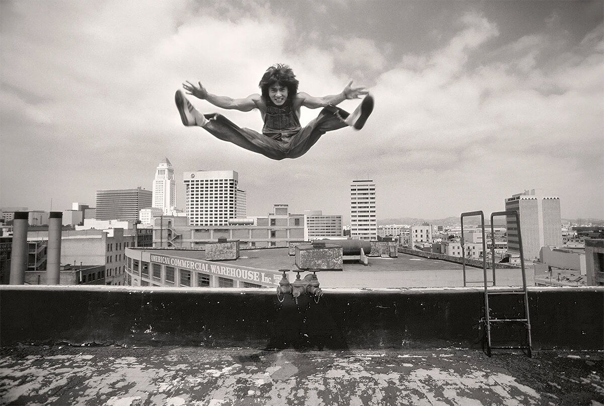
Jackie Chan © Tom Zimberoff

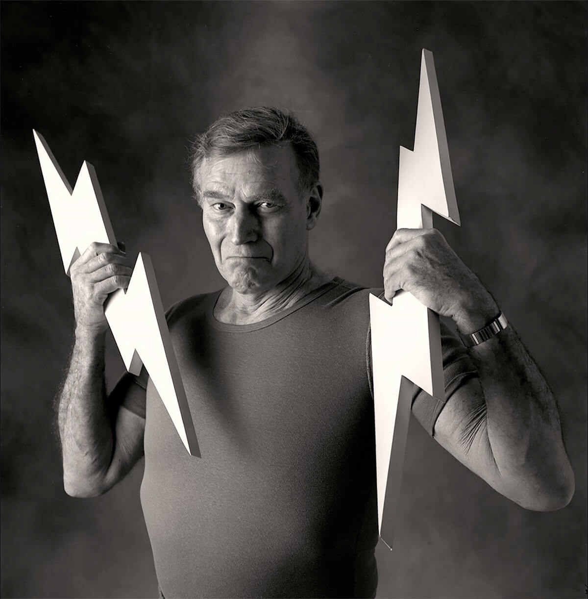
Charleton Heston © Tom Zimberoff

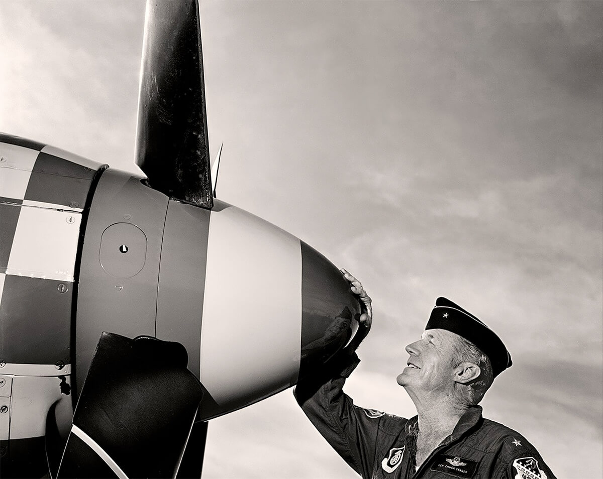
General Chuck Yeager, USAF © Tom Zimberoff

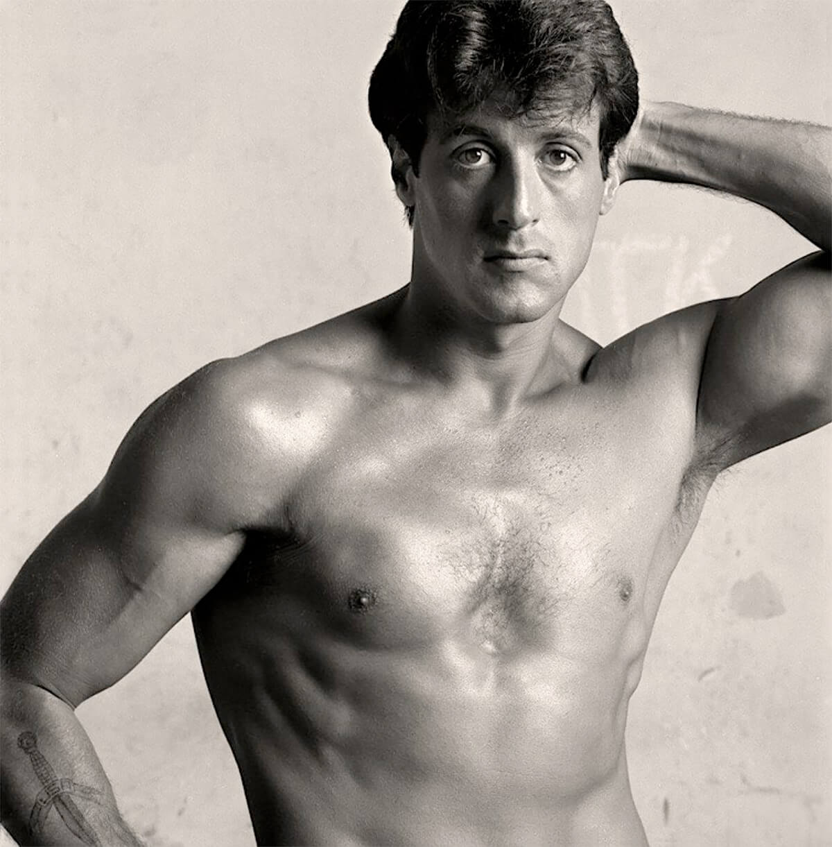
Sylvester Stalone © Tom Zimberoff

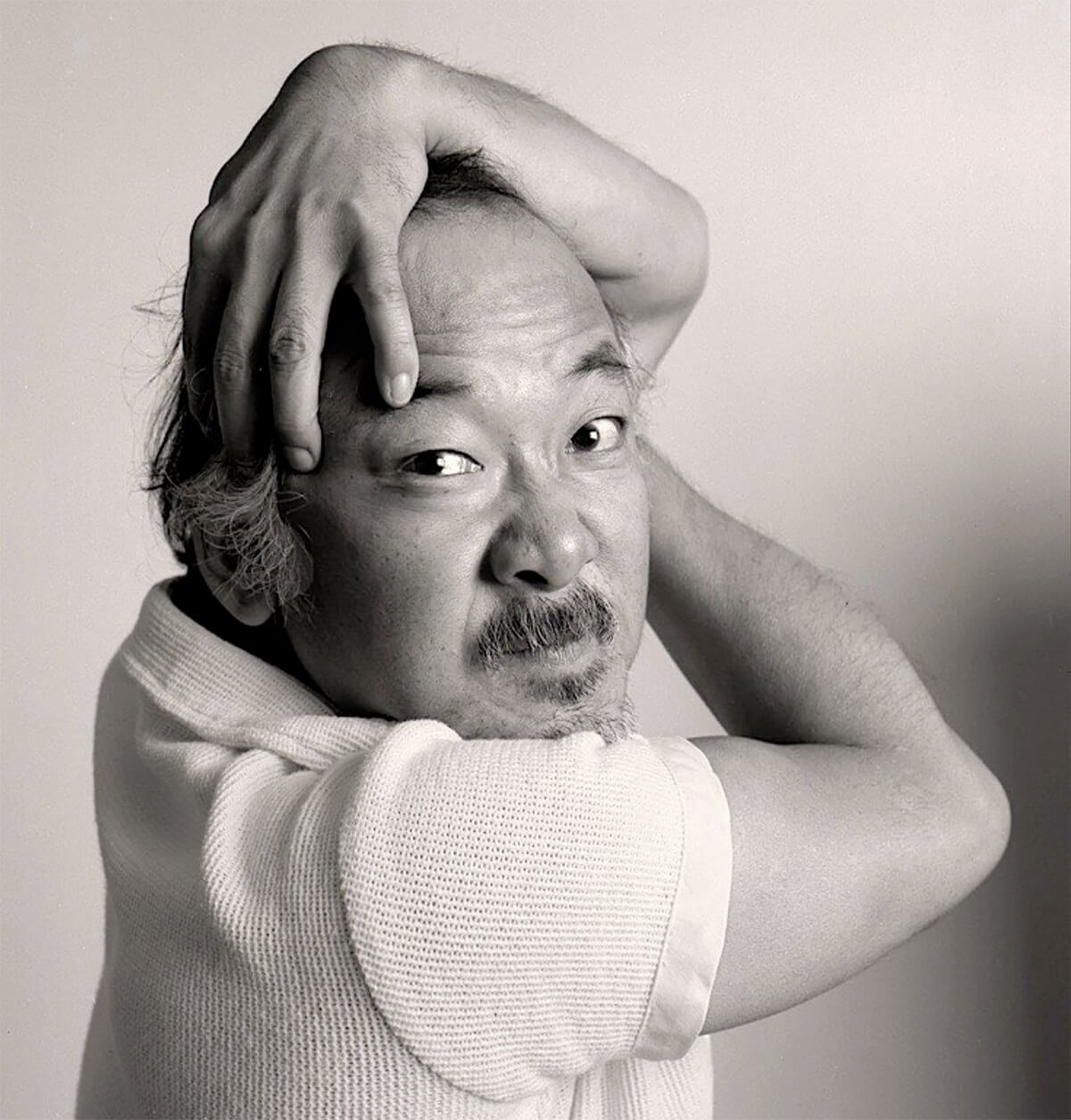
Pat Morita © Tom Zimberoff

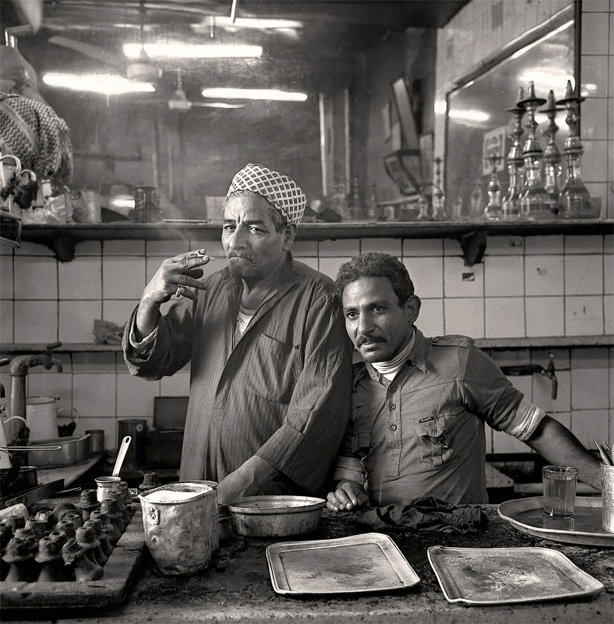
Tea Shop, Cairo © Tom Zimberoff

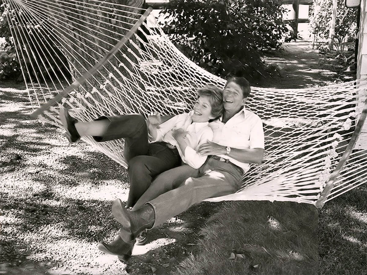
Ronald and Nancy Reagan © Tom Zimberoff

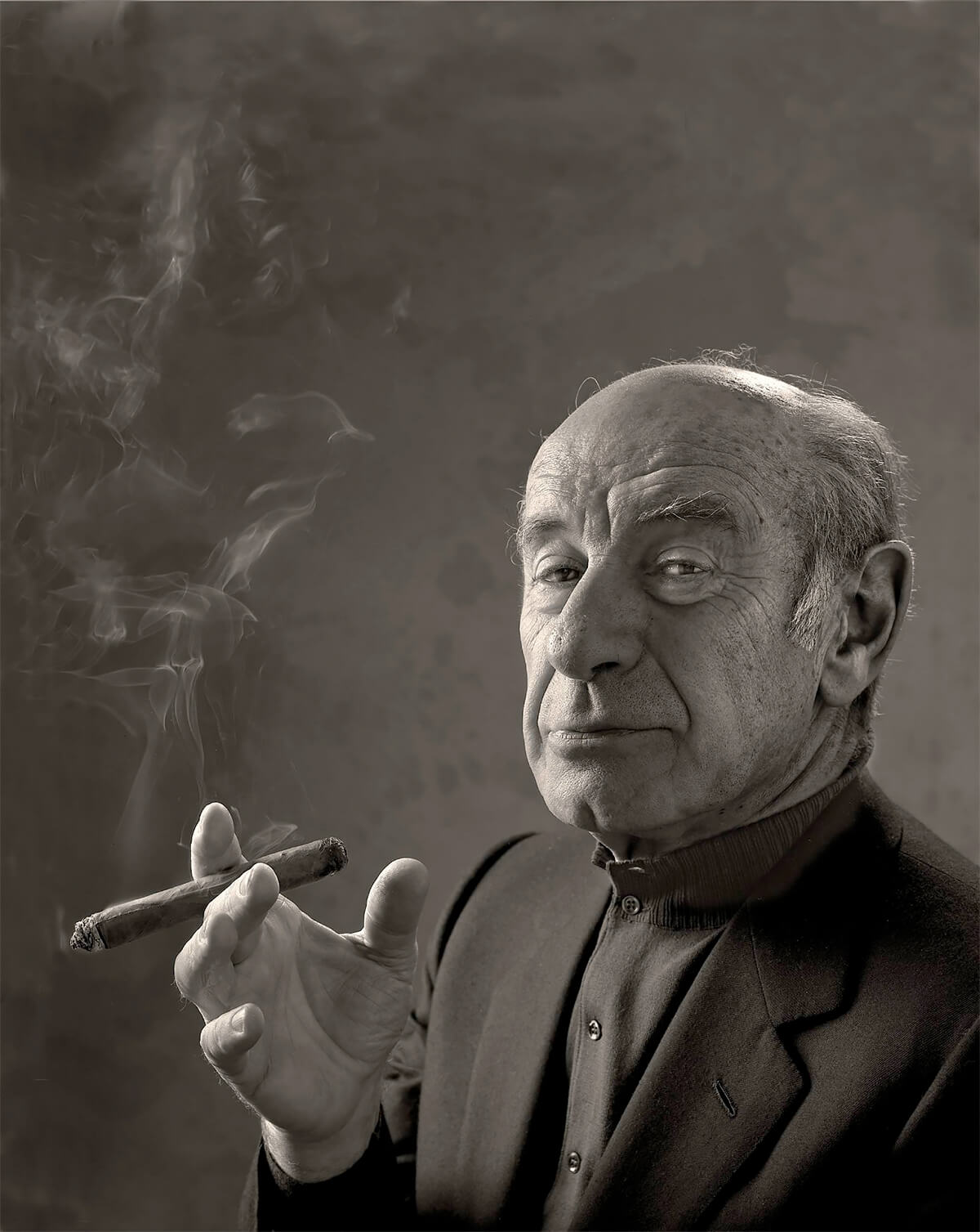
Erich Leinsdorf © Tom Zimberoff
